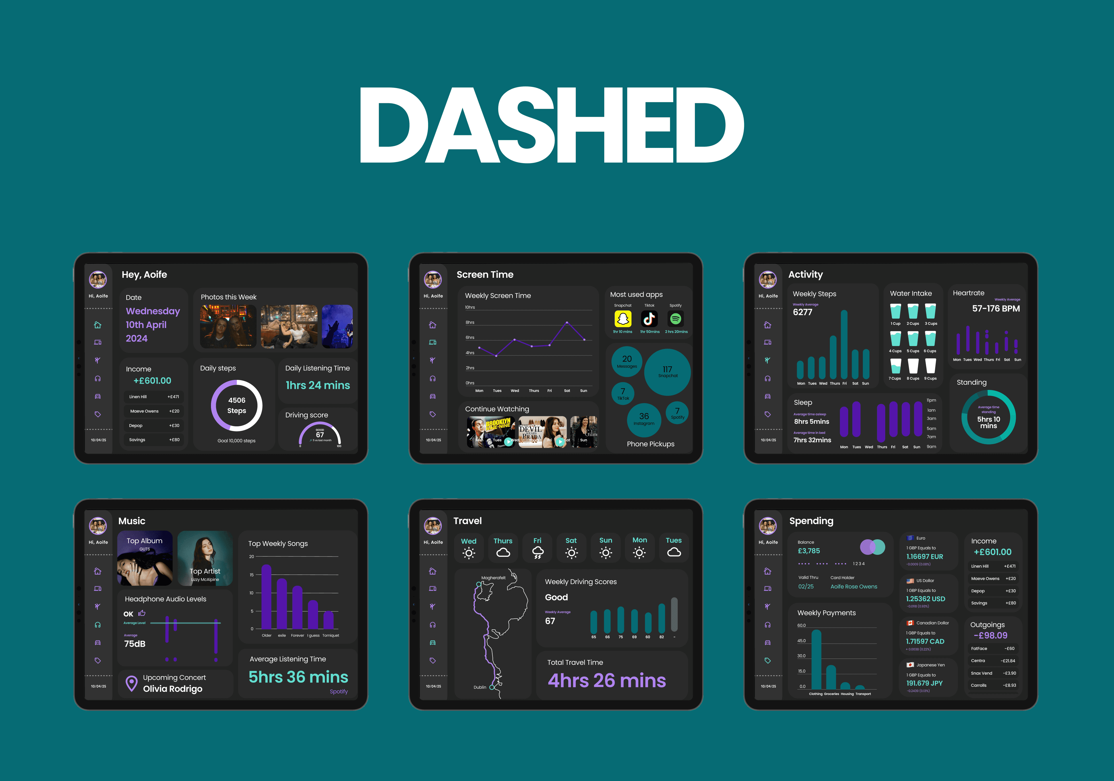
Your weekly dashboard tracks activity, screen time, spending.
Problem Statement:
The challenge was to present a week’s worth of personal data in a clear, visually appealing way, helping users easily understand their habits and activities without feeling overwhelmed.
Solution:
I designed an interactive dashboard with structured pages and simple navigation, making complex data accessible and visually engaging through thoughtful use of colours and typography.
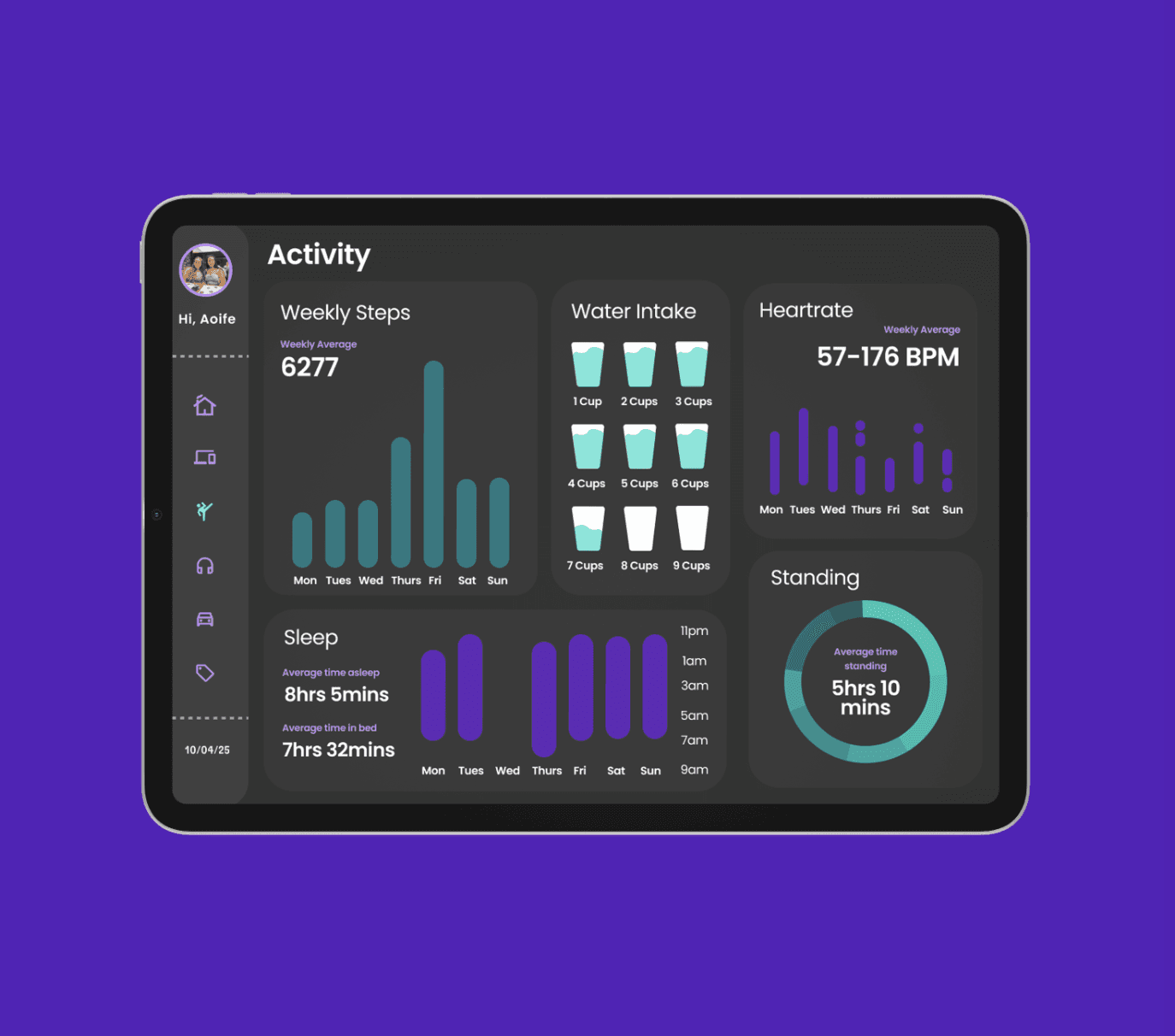
Over a week, I tracked personal data like app usage, music habits, activity, screen time, travel, spending, and sleep patterns using smartphone tools and spreadsheets. These insights informed a dashboard design that organises and visualises the data clearly and attractively.
Typography, Iconography, and Colour
I chose the Poppins typeface for its modern and versatile design. Its clean sans-serif style enhances readability and maintains consistency across headings and body text. For icons, I used Material Design icons for uniformity. Each screen has a distinct icon: a home for the home page, a laptop and phone for screen time, a karate figure for activity, headphones for music, a car for travel, and a price tag for spending. Icons are purple by default, turning blue when a page is selected. The colour scheme features a black background, light grey boxes, and accents of bright blue and purple. To improve accessibility, white is used for some text elements since the purple failed normal text contrast standards.
Menu System
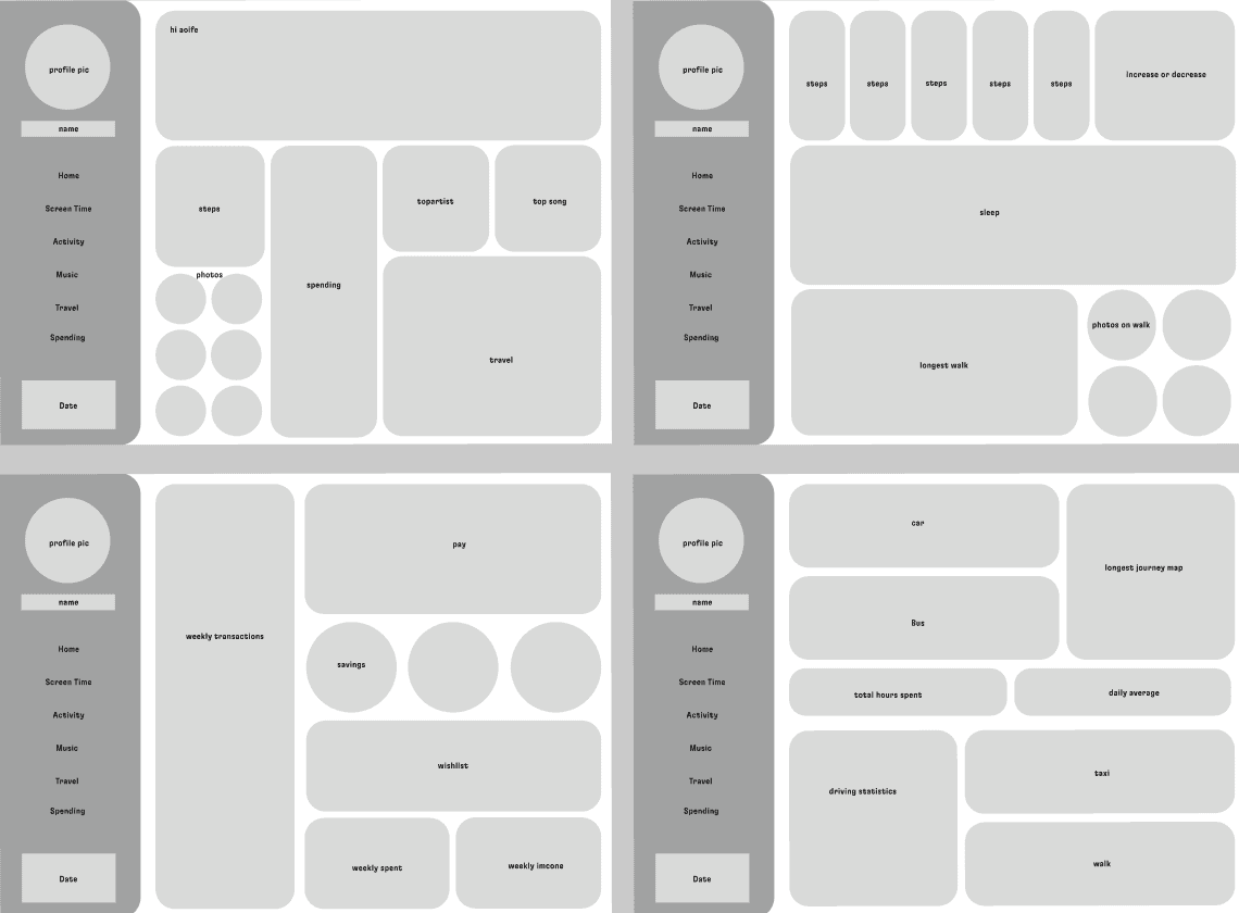
Designing the menu system required balancing functionality, clarity, and space efficiency. Initially, the menu was too large, so I refined it to be more compact, added titles, and experimented with layouts. The final version uses dashed lines to separate sections and a personalised greeting, enhancing user interaction and animations.
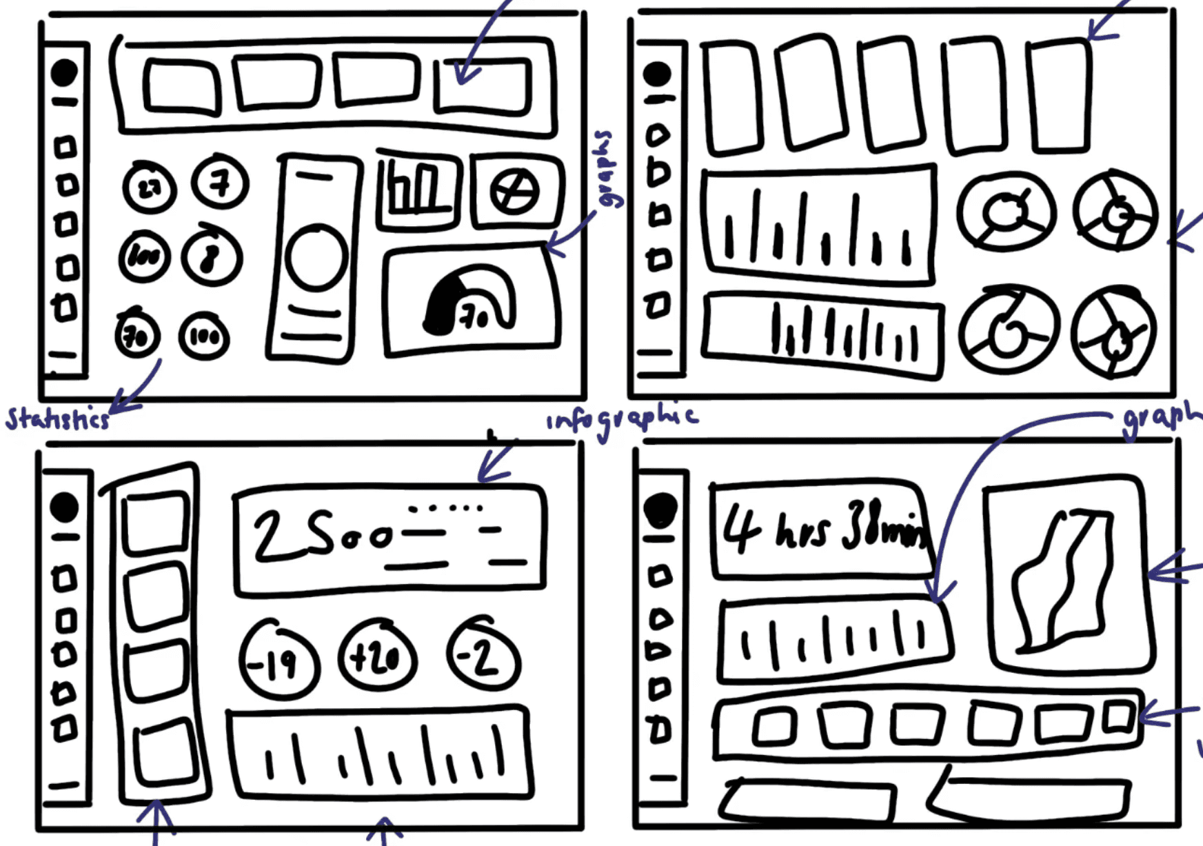
Graphs
Graphs feature a darker accent colour to highlight the active bar, with others retaining bright original hues. Using the multi-edit variants tool, I created interactive components linked to the default graph design, ensuring consistency and clarity in presenting data.
hb
I’m proud of creating this dashboard, overcoming challenges to deliver a polished design. I love the dark colour scheme with vibrant graph accents and believe the unique menu system sets it apart. The longest part was designing the interactive graphs as components, which made the dashboard cleaner and easier to understand. My favourite page is the activity section, showcasing insights through diverse graphs and infographics. Overall, this was my favourite and most successful project in Year 1.