Banking App With Brand Identity
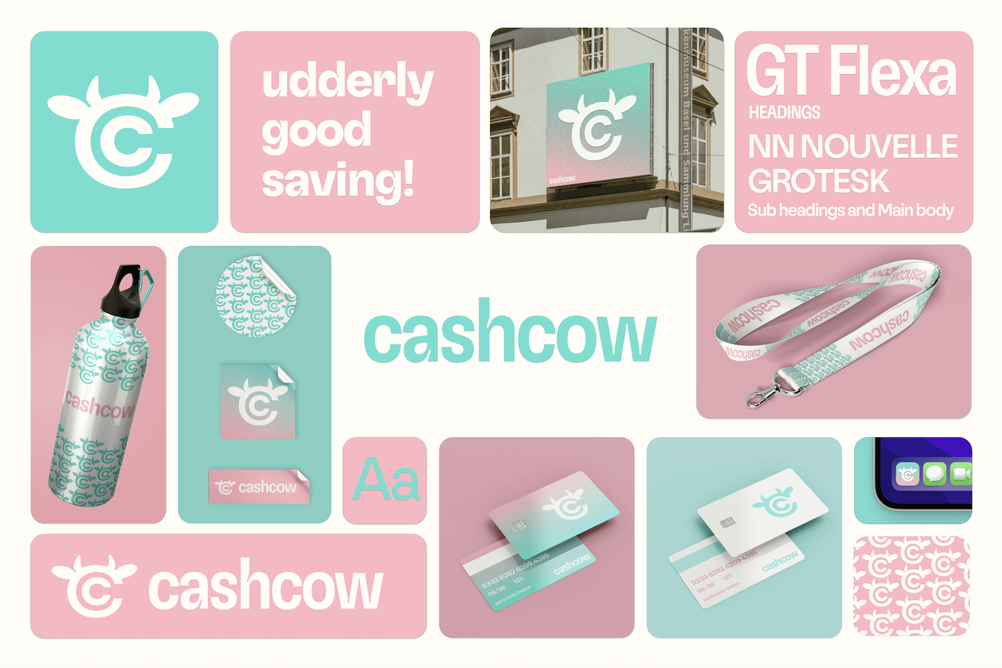
CashCow - Udderly Good Saving!
CashCow helps young people build strong financial habits through fun, intuitive goal-setting and a rewarding saving journey.
Problem Statement:
Young adults struggle to build consistent saving habits, often finding traditional financial tools uninspiring and lacking personalised, engaging features that motivate them to save effectively. This gap leaves many without the resources or encouragement to achieve economic stability and independence.
Solution
A user-friendly app designed to help young adults build better saving habits. By offering a fun, engaging platform with rewards, personalised financial insights, and easy-to-use saving tools, CashCow empowers users to set, track, and achieve their financial goals, making the journey to financial independence enjoyable and attainable.
CashCow's branding extends to real-world products like banking cards and promotional merchandise, using guerrilla marketing to foster emotional engagement with customers.
App Design
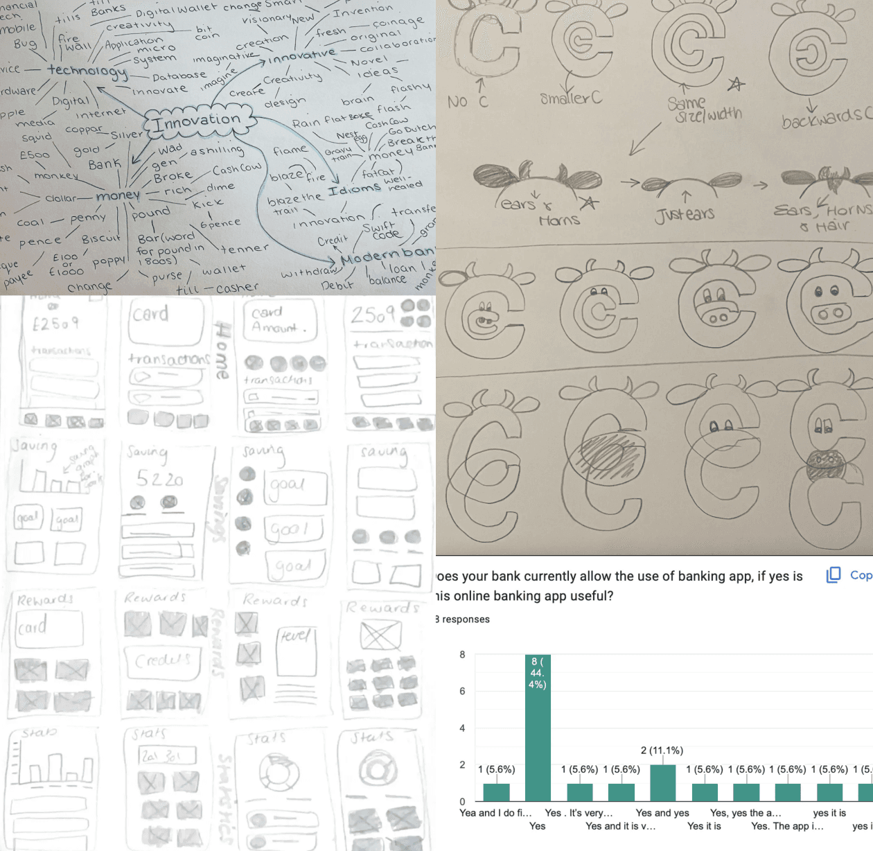
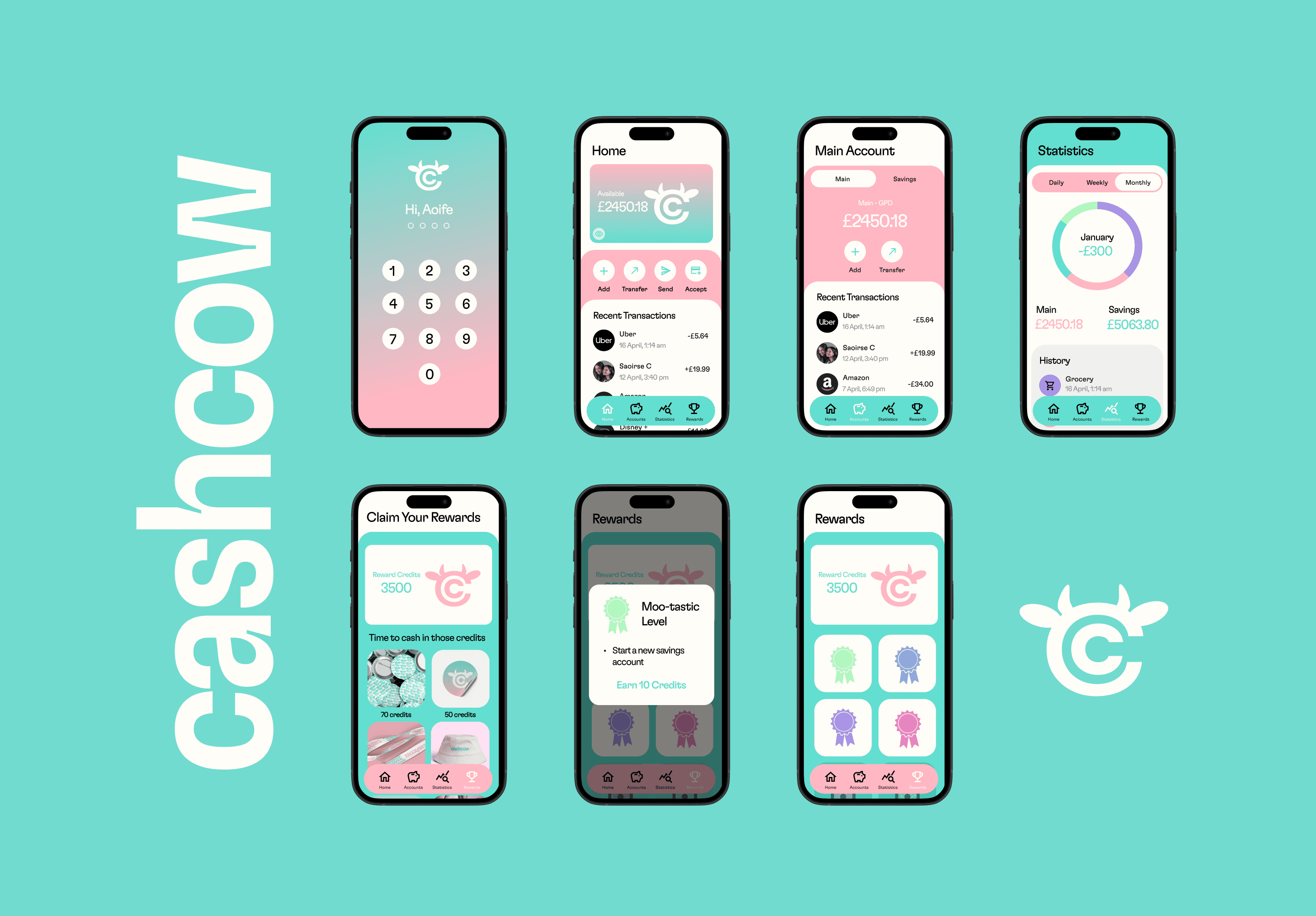
For the app design, inspiration was drawn from Revolut, featuring components such as balances, transaction history, saving options, and a rewards system. The design evolved through trial and error, overcoming challenges with space and widget functionality, ultimately improving the app's layout and user experience.
One major challenge was getting the reward tasks feature to open correctly on screen. Initially, the tasks would appear off-screen, disrupting the user experience. After researching solutions, I discovered Figma's overlay feature, which allowed me to display tasks seamlessly, creating a smoother and more effective user experience.
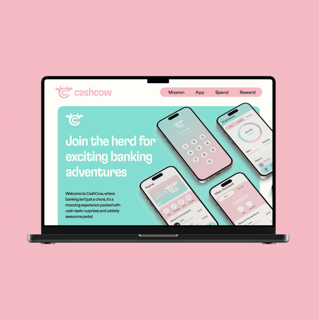
Landing Page
For the CashCow landing page, I created a layout that aligns with brand guidelines for a consistent look and feel. The sections include an opening statement, app features, user statistics, brand mission, rewards system, and a “How It Works” guide, with a contact area at the bottom. This design approach, using brand colours, typography, and icons, ensures a cohesive experience, making users feel connected to the app from the start.
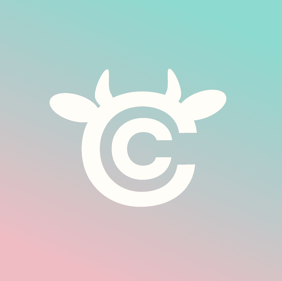
The name "CashCow" was chosen because it’s fun and catchy and aligns with the app’s goal of helping users accumulate savings. The branding uses a bright pastel colour palette, with a simple wordmark created using the GT Flexa typeface and a logo incorporating a cow theme with a "CC" monogram. For CashCow’s typography, I chose GT Flexa for headings due to its readability and character and NN Nouvelle Grotesk STD for subheadings and body text to add a fun, engaging feel that aligns with the brand’s values.
Overall, I enjoyed making the app especially the rewards page as I thought it was a fun and exciting way to encourage money-management. Lastly I think that creating the landing page really good the brand features, personality and function across to the user. I would like to develop this landing page so that it could be used on moblie and tablet. Overall, I really enjoyed this project, especially seeing my ideas come to life.